What Makes a Good Landing Page Design?
A correctly made landing page design can mark the difference between a sale made and a sale lost. Creating effective landing pages is a part of direct marketing strategy. For those who are still naïve to this, Landing Page is a page where visitor lands on your website on clicking a display ad or Google text advertisement. A few marketers who are new to this business might go wrong by directing all the PPC traffic to their home page. This would not help much in bringing quality experience for visitors and drawing good conversion rates. Landing pages are the hub of your lead generation efforts, which makes it important to connect every new campaign or new offer to a custom landing page. If you think homepage would serve the purpose, you are utterly wrong, because home pages are ambigious pages where users have less idea of what to do next.
However, before understanding the best practices let’s go through the questions, we should ask ourselves before building a landing page.
What is the goal of creating landing page?
Here defining goals mean defining your conversions. What user action you would want them to perform so that you can finally track your conversion rate. You want them to fill a form? You want them to buy something? You want them to download documents? Or something else! Define your conversion parameters, only them you’ll be able to track them.
Whom are you competing against?
Knowing your competitor’s strategy would help you copy that and do the same in less time. You can also deploy something different or better than what they are doing, but for that you must gain knowledge about your competitors. If they are doing something that works, you must follow the strategy.
Who will be your audience?
The more you understand your audience, the more you’ll be able to write persuasive content to cater to their needs. A persuasive content in the voice of your audience is the major factor in attracting them to your landing page.
Where is the traffic coming from?
Having a tailored landing page for each ad group would be a hefty process. So, to begin with you can create different landing page for users coming from Facebook, Google or Twitter. You can change the message displayed based on the user source.
What are the best practices to create good landing page design?
Great things are always simple! Buying that logic, a perfect landing page design should be simple to navigate through. If the users cannot navigate through your webpage, there is no use of getting them there. They would never convert. Here are some likewise best practices that one must follow to create a good landing page design:
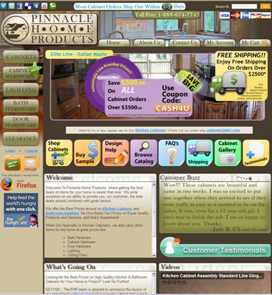
Cluttered and Messy Design
Picture credits: http://www.crosslinksuite.com/solutions/landing-page-design/
Design layout is a crucial factor in determining how your landing page will perform. If you manage to engage your visitors on your page for first 2-3 minutes, the chances of conversion increase. This is because people understand in first 1 minute what your page is offering. If you have a cluttered, messy content filled page with no images or colors, nobody will bother to go any further. Make your design simple and clean with decent amount of empty space. Make your special elements stand out viz. clear headline, call-to-action button.
High-quality simple content
Too much information smothers your visitors and hence increases the bounce rate. This doesn’t really mean you completely leave the content part entirely. Write content that is relevant, useful and rich content.
Clear Information Architecture
Flawless information structure defines the base of a landing page. Your information architecture must have clear and crisp design and shouldn’t leave any questions unanswered. It must tell your visitors what the next step is they need to follow in order to proceed. Keep your navigation simple, so that nothing hinders your visitor’s path for example unnecessary pop-ups.
Writing Benefits Before Features
Picture Credits: http://blog.wishpond.com/post/67761781022/7-landing-page-mistakes-that-are-costing-you
Except a few good ones all the marketers write features of their services, which is generally similar to all competitive websites. Benefits are the only thing which visitors are for. Similar to you look for when you search for any workshop. Mentioning benefits over features doesn’t mean you completely shun the features part. It’s just that you must focus on the benefits of your services more as compared to the features so that you could easily cater to what people are demanding.
Clear call-to-actions
Picture Credits: http://blog.wishpond.com/post/67761781022/7-landing-page-mistakes-that-are-costing-you
Clear call to action is all about telling your customers about what to do in big bold letters. Call-to-action buttons could be anywhere on the page, as long as they don’t disturb the users’ readability. Make sure you place them where they are clearly visible and easily clickable.
To the Point Form Fields
Picture Credits: http://blog.crazyegg.com/2014/07/15/remove-landing-page-elements/
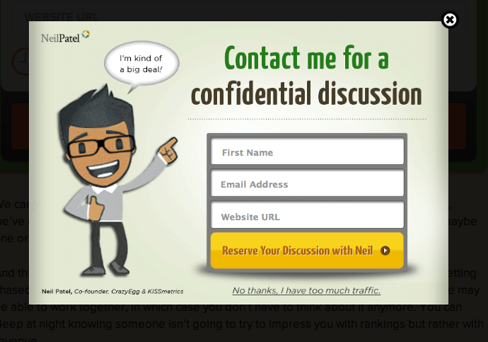
This can be really annoying if you don’t get the form fields right. Adding unnecessary details for the customers to fill will make them leave the page. Just try to add a few important form fields that you think would be required for further communication with the user.
Moreover, beside using all above important points, we can also consider some other effective tips to stand out your landing page by, including rich media (i.e. video, 3D and 2D animation), using real-time analytics & splitting your codebase into small pieces.
Last but not the least make sure your landing page is responsive to all the devices other than desktop computers so that you can bring more and more people to perform call-to-action. Also make sure whatever you write should relate to the reader. If you are thinking of building a landing page that actually converts, we can help you with the best landing page designs.
You can REACH OUT TO US here.
