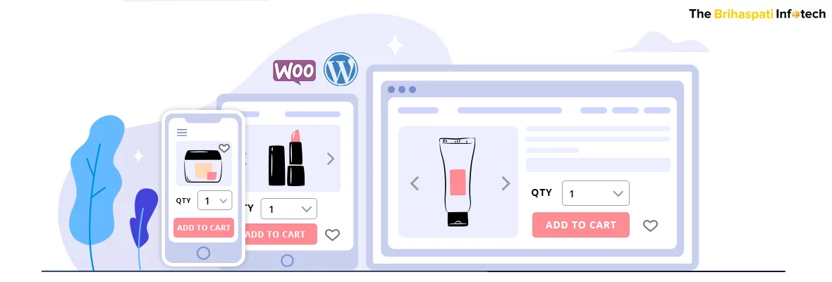
Building a Mobile-First Website – WordPress

Ever since the global mobile usage has exceeded the Desktop usage for browsing, Google has come up with several hints that mobile phone users are its new target. Google is experimenting on the mobile-first approach and has given bits of information on how it works and ways to prepare.
If you aren’t much used to the term mobile-first design yet, this is a process where the website development is primarily focused on the user experience for mobile users than on the desktop. The idea is to ensure that the website looks way more intuitive and actionable on mobile phones than on desktops.
Even though it looks easy from the outside, it needs a high degree of website design knowledge to find the best implementation. With that in mind, the WordPress development team at The Brihaspati Infotech recently helped a client with a website that follows the mobile-first design approach. In the process, we have ensured that the Google guidelines have been followed and the website is highly user friendly.
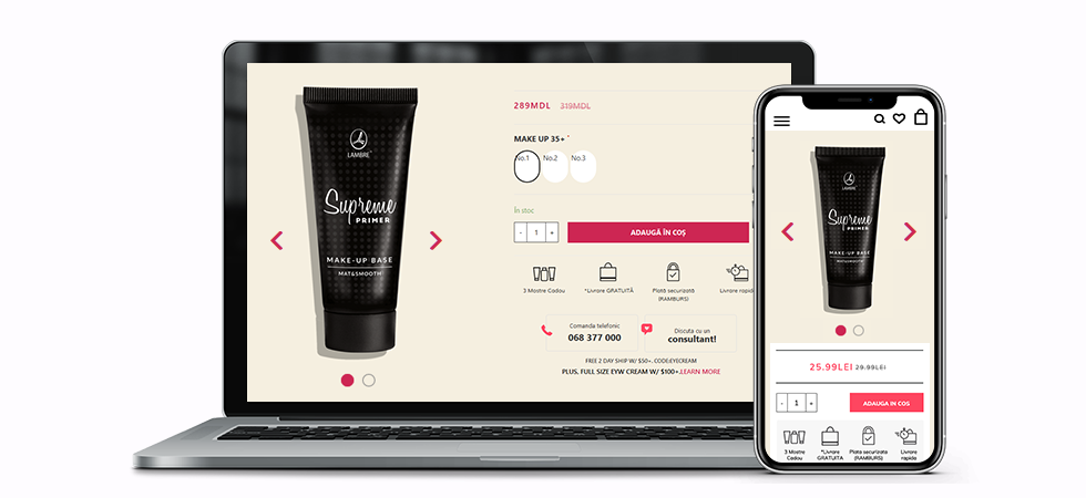
Here is a glimpse of the WooCommerce mobile-first theme we developed for the client.
Why should Google’s mobile-first initiative concern you?
Google has officially started offering special weightage to websites that follow the mobile-first design. Non-mobile friendly websites are being penalized by the search engine giant. The way Google is targeting mobile users, chances are, you might lose your place in the search engine if your website isn’t ready for mobile screens yet.
If the steps by Google alone doesn’t bother you enough,
Mobile e-commerce spending reached a whopping 39 Billion USD in the first quarter of 2019.
Source: Statista
Clearly, an online store that isn’t concerned about its mobile UI is losing a big chunk of the revenue. The reason is simple. People are more attached to their mobile phones than their laptops. It is easier to convince them on mobile to buy a T-Shirt, sign up for an ebook, or to book an appointment than on their laptops.
The other alternative that can engage your mobile audience is getting developed a native mobile app. But considering that it would require you to hire mobile app developers for respective OS platforms, it will cost you several extra dollars.
That sums up to a website design that is optimized for mobile users, allowing them to use the same website and offering a native environment.
The Google mobile-first approach emphasizes factors like:
- Image size of the pictures
- URLs and interlinking
- Length of content
- Loading speed on mobile
- Mobile responsiveness
- The text sections are visible even on the small screen
As a business owner, all you need is a third party web development agency that can take care of all these points to offer a website that fetches a good score on Google PageSpeed while offering an excellent user experience for your mobile audience.
Our approach to building Mobile-first WooCommerce Theme
The client owns an online store for cosmetics on WooCommerce. The store is the house for several products, followed by their images, descriptions, variants, and more.
The website followed the conventional website development process, prioritizing the user experience on the desktop. As a result, the experience on the mobile phone wasn’t quite user-friendly making it difficult for the users to find the right function in the desired format.
The need was to offer a user interface that seems kind to mobile users and engages them in every possible way. We achieved one part at a time:
WordPress Mobile-First Theme Development: Managing Content
Challenge:
Unlike desktop screens, Mobile screens don’t offer much room to add every detail. The descriptions were often distorted and only a horizontal screen could offer the full text.
Our solution:
It is imperative that the content offered on the smaller screen is fully optimized in terms of font size and the region they capture. What we did while building a mobile-optimized WooCommerce theme was defining the width of the content and selecting an optimum font style. The font size is taken special care of, to ensure that content can be read on the smallest of the mobile screens.
As a result, horizontal scrolling isn’t needed and the user can find the right amount of content at a given part.
Our WooCommerce experts managed the content data in sections below the product. Probable buyers can tap on the text sections to discover the product descriptions.
A bigger part of the desktop version includes the hovering function on action buttons. Whenever a user hovers the mouse cursor over action buttons, the color of the button changes, or the text is highlighted in some form. This part becomes insignificant while accessing the website on a mobile phone.
In our case, we removed the part, enlarged the button, and the text to make the best of the mobile user experience.
With that, the overall content is kept the same across the screens, only the way they are managed changes on the smaller screen.
Building WordPress mobile-first website: Optimizing Images
Challenge:
Due to a smaller screen, the images look way smaller on the mobile screen than on desktops, plus they often lose their quality.
Solution:
The screen orientation of a mobile phone largely varies compared to a desktop screen. Even on a landscape orientation, the mobile screen offers far lesser space. The images are often clipped from the ends or they aren’t in their best shape. What we usually find in most websites is, the images lose their quality on the smaller screen.
While developing the WooCommerce mobile-optimized theme, we prioritized the mobile website design over the desktop. The conventional website development process often involves designing the desktop CSS in the first place. As a result, the frontend developers are required to follow the desktop designs and make the desired changes to make it look mobile-oriented.
Under the mobile-first approach, tables are turned. The mobile user experience is given more priority, the mobile CSS is designed followed by the desktop design.
We optimized the images such that their quality isn’t lost while their ratio is a perfect match for the smaller screens.
The product catalogs also have a special design for mobile screens, the width is reduced and action buttons occupy the right space. The product page similarly provides ample space for the product image. Zoom in animations is provided on the product image that brings out the best of a mobile phone experience.
Building Mobile-First WooCommerce theme: Speed Optimization
Challenge:
The website was loaded with products and content. The website loaded very slow on mobile phones.
Solution:
One of the biggest issues with product heavy websites is the page loading speed on mobile. And it is obvious as the mobile phone isn’t designed to load so much website information in a go.
As a solution, we optimized the image size while ensuring that the quality isn’t compromised. Further, the content is mostly hidden in multiple sections. As a result, while components like product images are loaded quickly with a presentable screen for the mobile user, ample time is provided to load the text section in the background.
Having said that the website is designed first for mobile phones, every component, every section is optimized for the smaller screen. The performance of the mobile design is verified on various tools to ensure that an optimized website is delivered for the client, resulting in a website that also meets the Google guidelines on the approach.
With that, our experts delivered a mobile-first website, per the client’s demands. If you too are looking to optimize your WooCommerce store for mobile users, you can hire WordPress experts from us.
Our experience with WooCommerce Mobile-First Theme Development
The Brihaspati Infotech is a pioneer in E-Commerce development. Our team of expert E-Commerce developers has worked on a variety of projects that demanded tailored solutions for the businesses. Amazingly, we have leveraged the best technologies to bring them to reality.
Something that gives us an upper hand in optimizing websites for mobile is our expertise in cross-device website and application development. In the past, we have worked on projects where technologies like PWAs are leveraged which demands extensive knowledge for designs on multiple screen sizes.
Our blog Doctor appointment booking software speaks of our approach to PWA that allowed the client to provide mobile app-like features on his website for mobile users. Every component was taken care of keeping in the eye of the user experience for the mobile-based audiences.
Summing up with Mobile-first WordPress Theme Development
The mobile audience is the fuel your eCommerce store has been lacking. While getting designed a complete mobile app for your users can cost you a lot of time and money, reaching out via a mobile responsive website can turn out to be a handy alternative.
The current project wanted us to work on WooCommerce, however, you can contact us for more e-Commerce platforms. Our expertise in the field will save you plenty of time and resources.


